This is a documentation for Board Game Arena: play board games online !
Zone: Difference between revisions
(Adds additional information on the different types of patterns available for zone objects) |
|||
| (12 intermediate revisions by 4 users not shown) | |||
| Line 15: | Line 15: | ||
At first, don't forget to add "ebg/zone" as a dependency: | At first, don't forget to add "ebg/zone" as a dependency: | ||
<pre> | <pre> | ||
const [zone] = await importDojoLibs(['ebg/zone']); | |||
] | |||
</pre> | </pre> | ||
| Line 26: | Line 21: | ||
<pre> | <pre> | ||
constructor | constructor(){ | ||
console.log('yourgame constructor'); | console.log('yourgame constructor'); | ||
| Line 52: | Line 47: | ||
<pre> | <pre> | ||
zone.create( this, 'my_zone', <item_width>, <item_height> ); | zone.create( this.bga.gameui, 'my_zone', <item_width>, <item_height> ); | ||
zone.setPattern( <mode> ); | zone.setPattern( <mode> ); | ||
</pre> | </pre> | ||
| Line 89: | Line 84: | ||
== Patterns: positioning items within your zone == | == Patterns: positioning items within your zone == | ||
full source is available here : https://x.boardgamearena.net/data/themereleases/220811-1000/js/modules/zone.js | |||
The zone package comes with many positioning patterns pre-coded; these allow your items to take on a variety of arrangements. To set a pattern for your zone, call the following method on your zone object (once the zone has already been created, of course): | The zone package comes with many positioning patterns pre-coded; these allow your items to take on a variety of arrangements. To set a pattern for your zone, call the following method on your zone object (once the zone has already been created, of course): | ||
| Line 96: | Line 93: | ||
</pre> | </pre> | ||
The patterns that are available as part of the ebg/zone package are: 'grid' (which is the default, if you never actually call setPattern) | The patterns that are currently available as part of the ebg/zone package are: | ||
* 'grid' (which is the default, if you never actually call setPattern) | |||
* 'diagonal' | |||
* 'verticalfit' | |||
* 'horizontalfit' | |||
* 'ellipticalfit' | |||
* 'custom' | |||
=== grid === | === grid === | ||
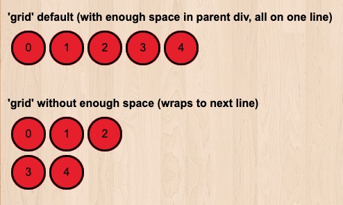
This is the default pattern for all zones when they are created. With enough horizontal space to fit all items in the zone, this pattern will simply arrange the items in a single horizontal row. However, if the zone is not allotted enough horizontal space to display all zone items in a single horizontal row, then the items will wrap to the next line. | This is the default pattern for all zones when they are created. With enough horizontal space to fit all items in the zone, this pattern will simply arrange the items in a single horizontal row (as in the first zone in the image below). | ||
However, if the zone is not allotted enough horizontal space to display all zone items in a single horizontal row, then the items will wrap to the next line as in the second zone in the image below). In the example image, restricting the zone width was done via: | |||
<pre>dojo.style('grid_zone_2', 'max-width', '175px');</pre> | |||
[[File:Zone_grid.jpg]] | |||
=== diagonal === | === diagonal === | ||
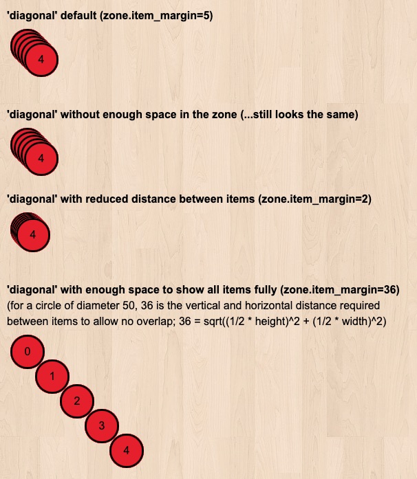
This pattern is great for creating the illusion of stacks (e.g., decks, counters, etc), because it will place each successive item in the zone a certain number of pixels below, and that same number of pixels to the right of the previous item in the zone. The exact number of pixels that are used for these offsets are controlled by the zone object attribute 'item_margin' (which defaults to 5) | This pattern is great for creating the illusion of stacks (e.g., decks, counters, etc), because it will place each successive item in the zone a certain number of pixels below, and that same number of pixels to the right of the previous item in the zone. The exact number of pixels that are used for these offsets are controlled by the zone object attribute 'item_margin' (which defaults to 5, as in the first zone in the image below). The behavior of this pattern does not appear to be affected by whether or not the zone is allotted enough horizontal or vertical space to display all items, as is demonstrated in the second zone of the image below, which was allotted less vertical and horizontal space (49px by 49px) than is required for displaying just one of the components (50px by 50px). | ||
Reducing the zone's item_margin will make each item in the zone be closer together, making it appear as if each item in the stack is thinner (as in the third zone in the image below), and increasing this value will make the items in your stack be further apart, giving an illusion of thicker components (as in the fourth zone in the image below). Here's how to alter item_margin for your zone: | |||
<pre> | |||
// For the third diagonal example: | |||
this.zone.diagonal_zone_3.item_margin = 2; | |||
// For the fourth diagonal example (with enough margin to fully display each component): | |||
this.zone.diagonal_zone_4.item_margin = 36; | |||
</pre> | |||
[[File:Zone_diagonal.jpg]] | |||
=== verticalfit === | === verticalfit === | ||
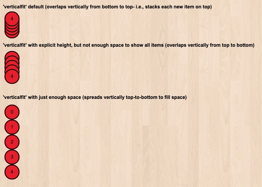
This pattern is useful if you want all items in your zone to be arranged in a single column, regardless of whether there is enough space to display each item fully. | This pattern is useful if you want all items in your zone to be arranged in a single column, regardless of whether there is enough space to display each item fully. In the first zone in the image below, no min-height or max-height was set for the zone (thus, the zone has the max-height of its first component), so all items were stacked upward on top of the original component, with item_margin (5px by default) vertical distance between each component, similar to how it was done for the diagonal pattern zones. | ||
If the zone is explicitly allotted more space than is required to display one component, but less than is required to show all fully (usually, this value is the sum of the component's heights, unless you are using sprites with strange transparency portions), then the items will overlap each other just enough to allow all of the items to fit into a single column of the allotted height (as in the second zone in the image below). However, with enough vertical space to fit all items fully in the zone, this pattern will simply arrange the items in a single vertical column (as in the third zone of the image below). Here is how the vertical distances were set for those two examples: | |||
<pre> | |||
// For the second verticalfit example, with overlap: | |||
dojo.style('verticalfit_zone_2', 'max-height', '100px'); | |||
// For the third verticalfit example, with just enough space to display all components: | |||
// (component height = 50px, multiplied by 5 components = 250px) | |||
dojo.style('verticalfit_zone_3', 'min-height', '250px'); | |||
</pre> | |||
[[File:Zone_verticalfit_1.jpg]] | |||
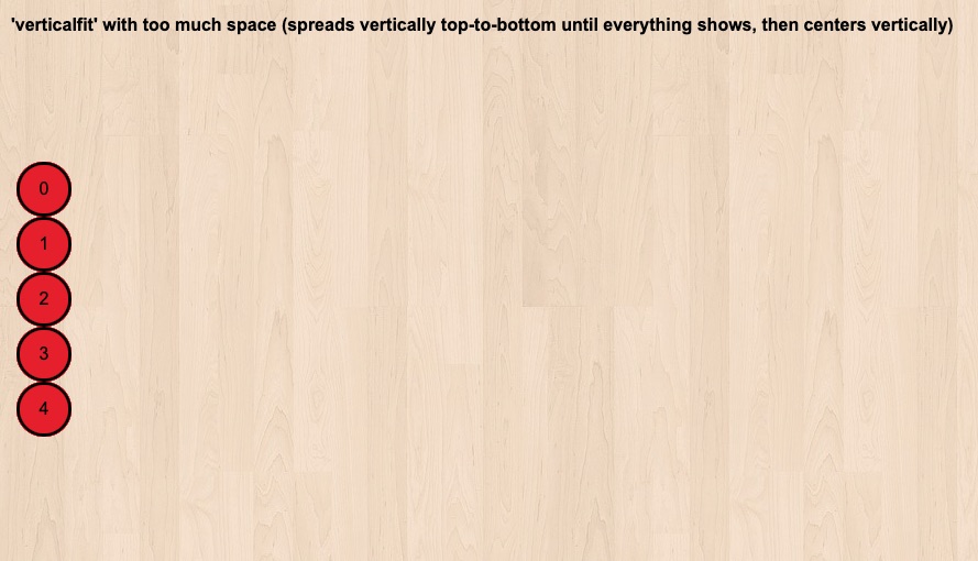
If the amount of vertical space for the zone is greater than what is required by the items and the margins between them, then the column of items will be centered within the 'min-height' of their container element (as in the image below, which has min-height set to 450px). | |||
[[File:Zone_verticalfit_2.jpg]] | |||
=== horizontalfit === | === horizontalfit === | ||
This pattern is useful if you want all items in your zone to be arranged in a single row, regardless of whether there is enough space to display each item fully. | This pattern is useful if you want all items in your zone to be arranged in a single row, regardless of whether there is enough space to display each item fully. If the width of this type of zone is not explicitly set, then it will be assumed to be then same as its parent element (which could lead to the items being centered within another one of your divs, as in the first zone of the image below). | ||
If the zone's width is explicitly set, but it is not allotted enough horizontal space to fully display each zone item in a single row, then the items will overlap each other just enough to allow all items to fit into a single row of the allotted width (as in the second zone of the image below). However, with enough horizontal space to fit all items fully in the zone, this pattern will simply arrange the items in a single horizontal row (as in the third zone of the image below; nearly identically to the 'grid' pattern with enough horizontal space, although without margins between items by default). Here's how the zone's width can be set: | |||
<pre> | |||
// For the second horizontalfit example: | |||
dojo.style('horizontalfit_zone_2', 'max-width', '100px'); | |||
// For the third horizontalfit example: | |||
dojo.style('horizontalfit_zone_3', 'min-width', '250px'); | |||
</pre> | |||
And, just as in the example for the default of this pattern, if the allotted horizontal space for the zone is greater than what is required by the items, then the row of items will be centered within the 'min-width' of the zone (as shown in the fourth zone of the image below, which has a max-width of 450px). | |||
[[File:Zone_horizontalfit.jpg]] | |||
=== ellipticalfit === | === ellipticalfit === | ||
This pattern will arrange all items in the zone in a circular (or elliptical) arrangement, with equal radial distance between each item. With enough vertical and horizontal space to fit all items in the zone into a single non-overlapping circle, this pattern will do just that. However, if the zone is not allotted enough vertical and horizontal space to fully display each zone item in a single circle, then the items that do not fit into the original circle will begin to form an additional concentric circle around the original circle | This pattern will arrange all items in the zone in a circular (or elliptical) arrangement, with equal radial distance between each item. With enough vertical and horizontal space to fit all items in the zone into a single non-overlapping circle, this pattern will do just that. | ||
[[File:Zone_ellipticalfit_1.jpg]] | |||
However, if the zone is not allotted enough vertical and horizontal space to fully display each zone item in a single circle, then the items that do not fit into the original circle will begin to form an additional concentric circle around the original circle. | |||
[[File:Zone_ellipticalfit_2.jpg]] | |||
In this second circle, items *will* overlap if there is not enough space for them all to be fully displayed. | |||
[[File:Zone_ellipticalfit_3.jpg]] | |||
=== custom === | === custom === | ||
If you want complete control on how your objects are laid out inside the Zone, you can determine their coordinates after their number when being added to the zone. Here is how to do it, when defining your Zone properties in the javascript setup: | If you want complete control on how your objects are laid out inside the Zone, you can determine their coordinates after their number when being added to the zone. | ||
[[File:Zone_custom.jpg]] | |||
Here is how to do it, when defining your Zone properties in the javascript setup: | |||
<pre> | <pre> | ||
| Line 144: | Line 210: | ||
}; | }; | ||
</pre> | </pre> | ||
[[Category:Studio]] | |||
Latest revision as of 14:44, 29 December 2025
The Zone component is meant to organise items of the same type inside a predefined space.
Zone in action
If you want to see how Zone works, please try "Can't Stop" or "Niagara" on BGA, or watch a game in progress or game replay.
In Can't Stop, zone is used to display the bhikkus ascending the mountain when there is more than one on the same space (diagonal mode).
In Niagara, it is used to display the canoes over the circles going down the river (custom mode).
How to use Zone
At first, don't forget to add "ebg/zone" as a dependency:
const [zone] = await importDojoLibs(['ebg/zone']);
Then, declare a new variable in your class for the Zone object:
        constructor(){
        console.log('yourgame constructor');

        // Zone control
        this.myZone = new ebg.zone();
Now, in your template file, you must add a div that will host this zone:
<div id="my_zone"></div>
And set its width (and optionally, height and position) in CSS:
#my_zone {
  width: 100px;
}
Then in your Javascript setup, attach your Zone component to the div and define its properties :
            zone.create( this.bga.gameui, 'my_zone', <item_width>, <item_height> );
            zone.setPattern( <mode> );
- <item_width> is an integer for the width of the objects you want to organise in the zone
- <item_height> is an integer for the height of the objects you want to organise in the zone
- <mode> is one of 'grid' (objects will be put on lines from top left to bottom right, wrapping when there is not enough space left on the line, relatively to the width you have defined) 'diagonal' (objects will be organised on a top left to bottom right diagonal, overlapping each other) or 'custom' (objects will be organised depending upon their number and the coordinates that you provide - see below)
Since the width of the Zone is defined statically, beware of not letting items overflow on small screens. If you need a design-responsive component, consider using the Stock component instead.
Now your zone is ready to be used!
After creating an object that you want to add to the zone as a classic HTML template (dojo.place / this.format_block), you can simply use:
zone.placeInZone( <object_id>, <weight> );
- <object_id> is the string identifier for your object 'my_object_id'
- <weight> is an optional parameter used to sort items
To remove an item, use:
zone.removeFromZone( <object_id>, <destroy?>, <to> );
- <object_id> is the string identifier for your object 'my_object_id'
- <destroy?> is a boolean indicating if the object should be destroyed after being removed
- <to> is the destination the object must be slided to when being removed (before being eventually destroyed)
You can also:
- remove all items from the zone (and destroy them) using zone.removeAll();
- get the number of items in your zone using zone.getItemNumber();
- get an array of the ids of all the items using zone.getAllItems();
Patterns: positioning items within your zone
full source is available here : https://x.boardgamearena.net/data/themereleases/220811-1000/js/modules/zone.js
The zone package comes with many positioning patterns pre-coded; these allow your items to take on a variety of arrangements. To set a pattern for your zone, call the following method on your zone object (once the zone has already been created, of course):
zone.setPattern('pattern_name') // ...where 'pattern_name' is actually one of the many pre-formatted patterns of the package
The patterns that are currently available as part of the ebg/zone package are:
- 'grid' (which is the default, if you never actually call setPattern)
- 'diagonal'
- 'verticalfit'
- 'horizontalfit'
- 'ellipticalfit'
- 'custom'
grid
This is the default pattern for all zones when they are created. With enough horizontal space to fit all items in the zone, this pattern will simply arrange the items in a single horizontal row (as in the first zone in the image below).
However, if the zone is not allotted enough horizontal space to display all zone items in a single horizontal row, then the items will wrap to the next line as in the second zone in the image below). In the example image, restricting the zone width was done via:
dojo.style('grid_zone_2', 'max-width', '175px');
diagonal
This pattern is great for creating the illusion of stacks (e.g., decks, counters, etc), because it will place each successive item in the zone a certain number of pixels below, and that same number of pixels to the right of the previous item in the zone. The exact number of pixels that are used for these offsets are controlled by the zone object attribute 'item_margin' (which defaults to 5, as in the first zone in the image below). The behavior of this pattern does not appear to be affected by whether or not the zone is allotted enough horizontal or vertical space to display all items, as is demonstrated in the second zone of the image below, which was allotted less vertical and horizontal space (49px by 49px) than is required for displaying just one of the components (50px by 50px).
Reducing the zone's item_margin will make each item in the zone be closer together, making it appear as if each item in the stack is thinner (as in the third zone in the image below), and increasing this value will make the items in your stack be further apart, giving an illusion of thicker components (as in the fourth zone in the image below). Here's how to alter item_margin for your zone:
// For the third diagonal example:
this.zone.diagonal_zone_3.item_margin = 2;

// For the fourth diagonal example (with enough margin to fully display each component):
this.zone.diagonal_zone_4.item_margin = 36;
verticalfit
This pattern is useful if you want all items in your zone to be arranged in a single column, regardless of whether there is enough space to display each item fully. In the first zone in the image below, no min-height or max-height was set for the zone (thus, the zone has the max-height of its first component), so all items were stacked upward on top of the original component, with item_margin (5px by default) vertical distance between each component, similar to how it was done for the diagonal pattern zones.
If the zone is explicitly allotted more space than is required to display one component, but less than is required to show all fully (usually, this value is the sum of the component's heights, unless you are using sprites with strange transparency portions), then the items will overlap each other just enough to allow all of the items to fit into a single column of the allotted height (as in the second zone in the image below). However, with enough vertical space to fit all items fully in the zone, this pattern will simply arrange the items in a single vertical column (as in the third zone of the image below). Here is how the vertical distances were set for those two examples:
// For the second verticalfit example, with overlap:
dojo.style('verticalfit_zone_2', 'max-height', '100px');

// For the third verticalfit example, with just enough space to display all components:
// (component height = 50px, multiplied by 5 components = 250px)
dojo.style('verticalfit_zone_3', 'min-height', '250px');
If the amount of vertical space for the zone is greater than what is required by the items and the margins between them, then the column of items will be centered within the 'min-height' of their container element (as in the image below, which has min-height set to 450px).
horizontalfit
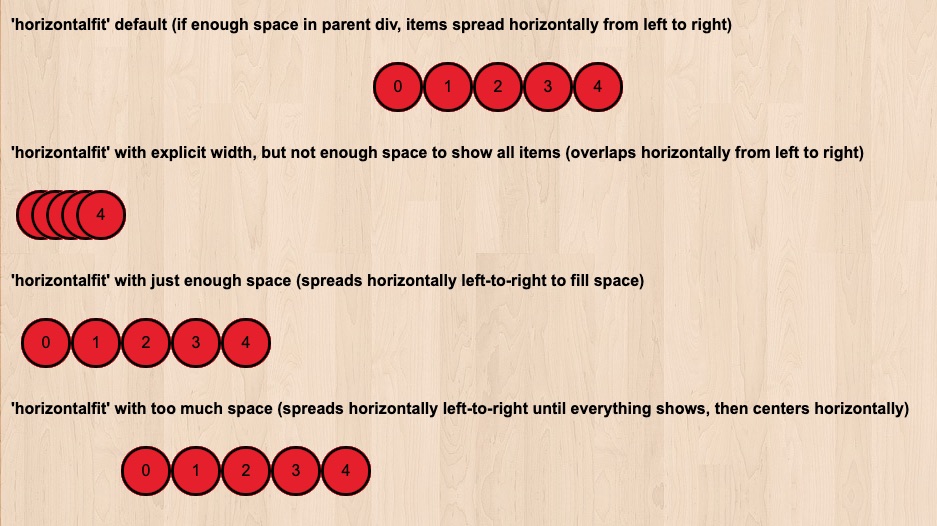
This pattern is useful if you want all items in your zone to be arranged in a single row, regardless of whether there is enough space to display each item fully. If the width of this type of zone is not explicitly set, then it will be assumed to be then same as its parent element (which could lead to the items being centered within another one of your divs, as in the first zone of the image below).
If the zone's width is explicitly set, but it is not allotted enough horizontal space to fully display each zone item in a single row, then the items will overlap each other just enough to allow all items to fit into a single row of the allotted width (as in the second zone of the image below). However, with enough horizontal space to fit all items fully in the zone, this pattern will simply arrange the items in a single horizontal row (as in the third zone of the image below; nearly identically to the 'grid' pattern with enough horizontal space, although without margins between items by default). Here's how the zone's width can be set:
// For the second horizontalfit example:
dojo.style('horizontalfit_zone_2', 'max-width', '100px');

// For the third horizontalfit example:
dojo.style('horizontalfit_zone_3', 'min-width', '250px');
And, just as in the example for the default of this pattern, if the allotted horizontal space for the zone is greater than what is required by the items, then the row of items will be centered within the 'min-width' of the zone (as shown in the fourth zone of the image below, which has a max-width of 450px).
ellipticalfit
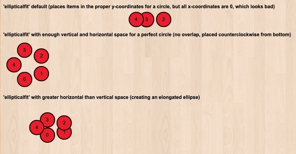
This pattern will arrange all items in the zone in a circular (or elliptical) arrangement, with equal radial distance between each item. With enough vertical and horizontal space to fit all items in the zone into a single non-overlapping circle, this pattern will do just that.
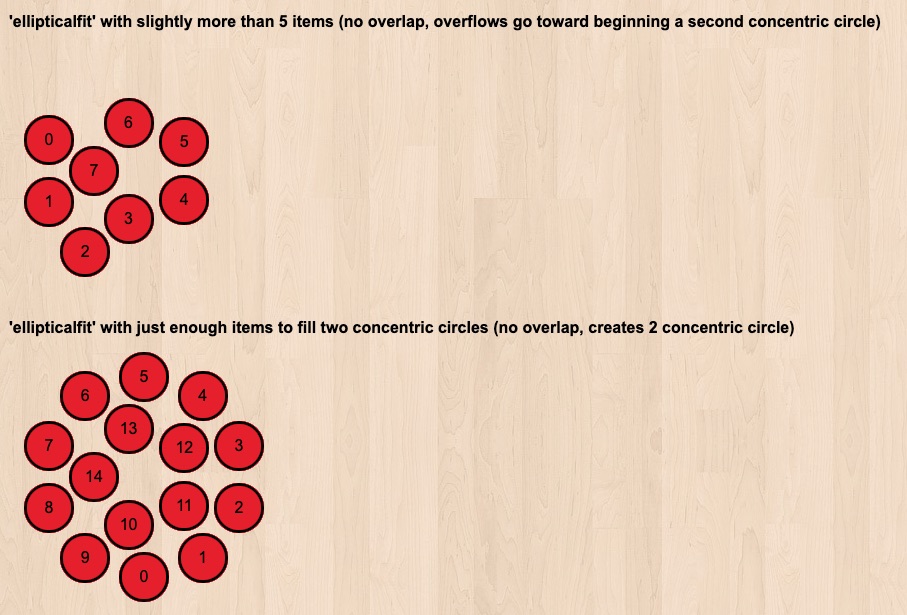
However, if the zone is not allotted enough vertical and horizontal space to fully display each zone item in a single circle, then the items that do not fit into the original circle will begin to form an additional concentric circle around the original circle.
In this second circle, items *will* overlap if there is not enough space for them all to be fully displayed.
custom
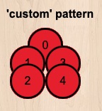
If you want complete control on how your objects are laid out inside the Zone, you can determine their coordinates after their number when being added to the zone.
Here is how to do it, when defining your Zone properties in the javascript setup:
                this.zone.setPattern( 'custom' );

                this.zone.itemIdToCoords = function( i, control_width ) {
                    if( i%8==0 )
                    {   return {  x:1,y:19, w:60, h:30 }; }
                    else if( i%8==1 )
                    {   return {  x:30,y:38, w:60, h:30 }; }
                    else if( i%8==2 )
                    {   return {  x:42,y:8, w:60, h:30 }; }
                    else if( i%8==3 )
                    {   return {  x:5,y:58, w:60, h:30 }; }
                    else if( i%8==4 )
                    {   return {  x:5,y:24, w:60, h:30 }; }
                    else if( i%8==5 )
                    {   return {  x:35,y:43, w:60, h:30 }; }
                    else if( i%8==6 )
                    {   return {  x:47,y:13, w:60, h:30 }; }
                    else if( i%8==7 )
                    {   return {  x:10,y:63, w:60, h:30 }; }
                };
